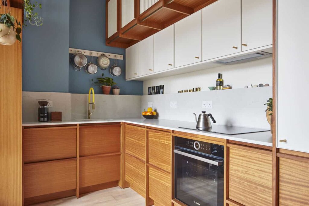
Japanese kitchen spaces are designed on the principles of simplicity and subtleness. Using materials in the natural form, balanced asymmetry is often seen in such designs. Japanese kitchen design radiates energy through solitude and calmness along with modesty in the design approach.
Design 1
A Zen kitchen that is bright, airy and spacious yet minimalistic at the same time, large windows and the lights also bring a freshness to the space. An open plan, this design is perfect for a monochromatic yet classic look. A simple planter adds to a pop of color that stands out.
Design 2
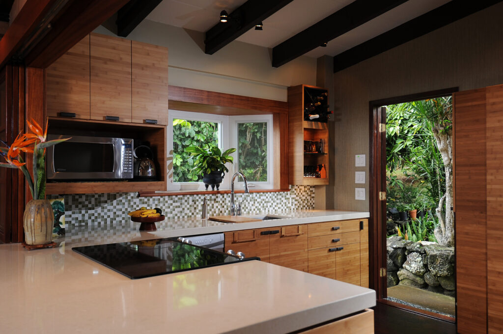
An L-shaped kitchen counter and the combination of white and black make this kitchen minimalistic yet functional. Dynamism and movement is brought in through the use of checkered backsplash tiles. The green outdoors bring liveliness to the overall look and the fresh flowers on the counter make it visually appealing.
Design 3

A sleek yet modern design that is complete with the latest appliances and a functional kitchen island, the space is well divided for circulation and brings about a clean look. The simple, modern yet elegant bar chairs used for the kitchen island bring interest to the kitchen design.
Design 4
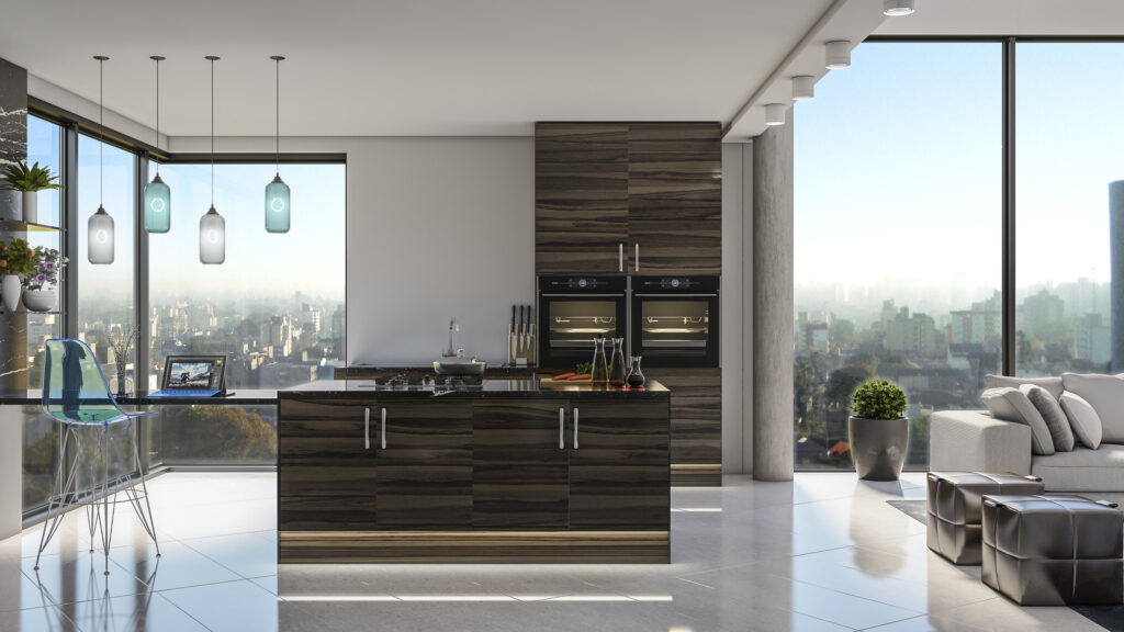
A spacious and airy Japanese kitchen design, the room has large windows that bring in fresh daylight and an incredible view of the city outside. The dark wood used for furniture and the profile lighting used to highlight make the space look classy and elegant. The pendant light above the working island add a touch of traditional elegance. The clear floor space makes the room look uncluttered giving it an overall fresh vibe.
Design 5
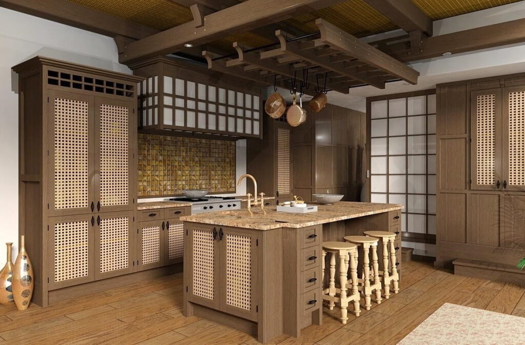
The use of traditional materials is explicitly seen in this design. The rattan, wicker wood textures and colors used throughout make this a very comfortable and cozy space. The matching backsplash tiles along with the matt matching fittings give a sense of sophistication. A rustic look is well merged with the decor by the use of kitchen island stools. Small decor elements added to the space make it interesting, lively and bring about a certain warmth to the area.
Design 6

An open plan kitchen, this design is well lit with the plentiful daylight flooding through the large openings. Subway tiles used for backsplash, open shelving and the use of wooden textures and materials give this room a rustic vibe yet keeping the overall space modern minimalistic and clutter free.
Design 7
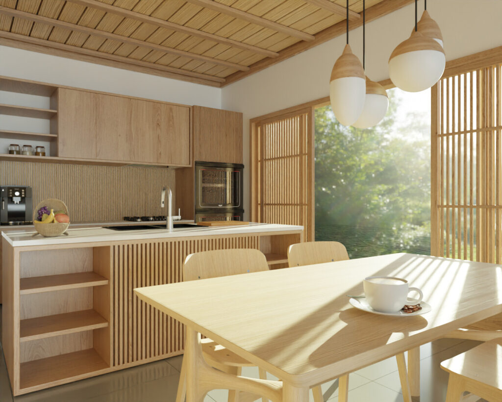
This clean white kitchen paired with wood tones, looks visually appealing because of the sunlight flowing in through the opening. The clever use of wood for the opening as well as the cabinet panelling for the kitchen island give the space a very airy look. The use of cluster lighting over the dining area gives the room depth and dimension.
Design 8
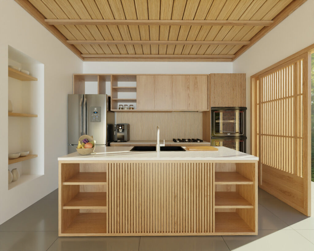
A design dominated by wooden textures and white color, the space also sees the use of modern kitchen equipment and some clean kitchen countertops. The niche is well used for some open shelving for the display of cookware and other decor items. Bright light makes the space seem bigger and brighter.
Design 9
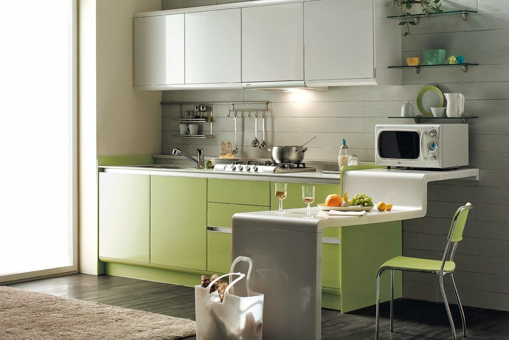
The clever use of green as an accent color gives this design a different dimension than any regular Japanese kitchen. The organic flow kitchen counter design is well designed and gives the kitchen an added utility space. Bright and spacious, the accent light over the cooking range also lends some utility to the cooking area. The overhead cabinets designed in white avoid a heavy look.
Design 10
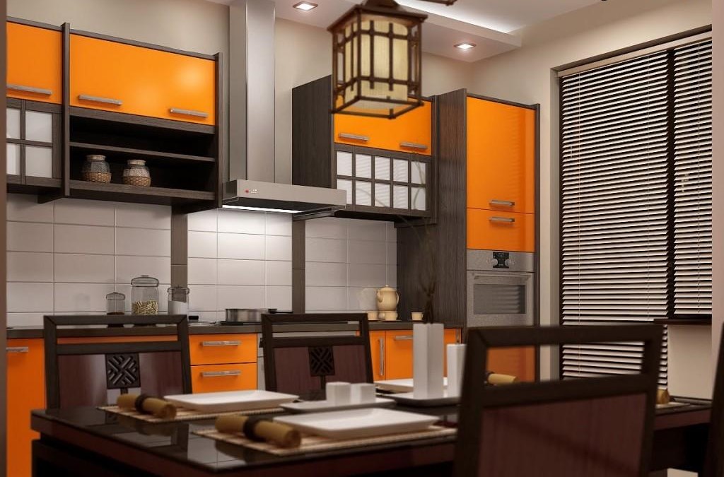
The use of warm colors for this design make it a rather unusual one. Minimalistic with clean lines and sophisticated dinnerware, this kitchen is an ideal design for the Japanese style. The lampshade above the dining table adds a subtle elegance while the lighting above the cooking range makes the space brighter offering a complete pleasant experience.
Design 11
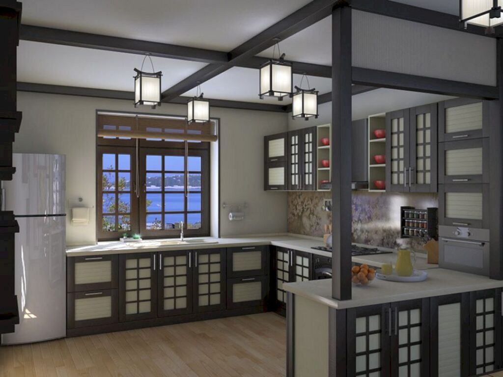
A uniformly designed kitchen cabinetry, this is a minimalistic kitchen with frame work dominating the design style and accentuated by ceiling lights. The mix of patterns for the cabinet shutters with a mix of some open shelving display, the backsplash compliments the color of the cabinets. Sunlight floods the room making the space bright and lively.
Design 12
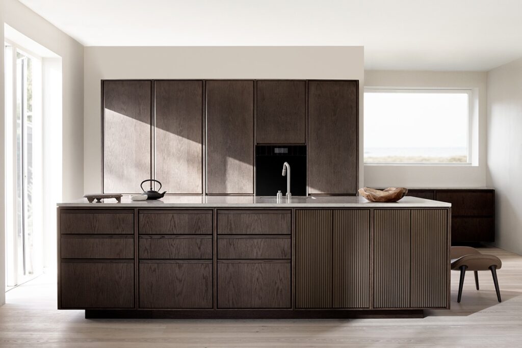
An absolute minimalist design, this style draws some clear inspiration from the Scandinavian style as well. Essential accessories and decor elements that add visual depth are the only add-ons to this kitchen design. A rich tone of brown overall makes this design stand out with elegance, while the sunlight flooding the room make it fresh and airy.
Design 13
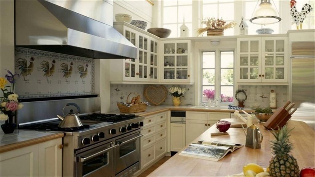
A white design that shows stark references to the rustic style, the space is cozy and warm with the indirect daylight brightening the room. Decor elements are wisely placed above the functional space creating a pretty display. Printed backsplash tiles and accent pieces placed all over give the room a charming look.
Design 14
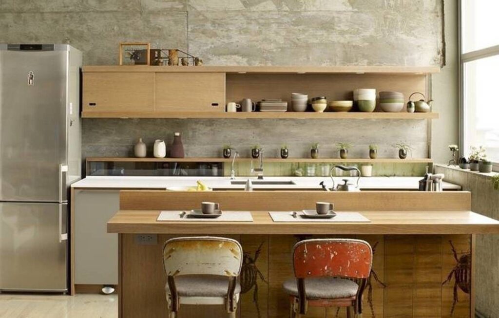
A clean and crisp design, this kitchen, with exposed concrete wall finishing, has an industrial look to it. The light wood tone makes an interesting visual contrast that is highlighted with the natural daylight flooding the room. The dining chairs add a flair of the rustic design style to the space.
Design 15
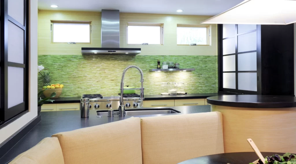
A seemingly colorful kitchen design, the bright combination of green and orange paired with indoor lighting makes this kitchen lively and interesting. The use of bold black for the kitchen countertops and the window framing add dimension to the space. Daylight flows into the room through the windows over the main countertop.
Design 16
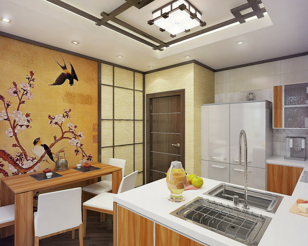
A white and brown design, the wall painting lends a Zen vibe to the space. Calming and peaceful, the colors used in the kitchen complement each other very well. White backsplash tiles match the countertops to create a look that blends together. The small accent pieces all over make the space comfortable.
Design 17
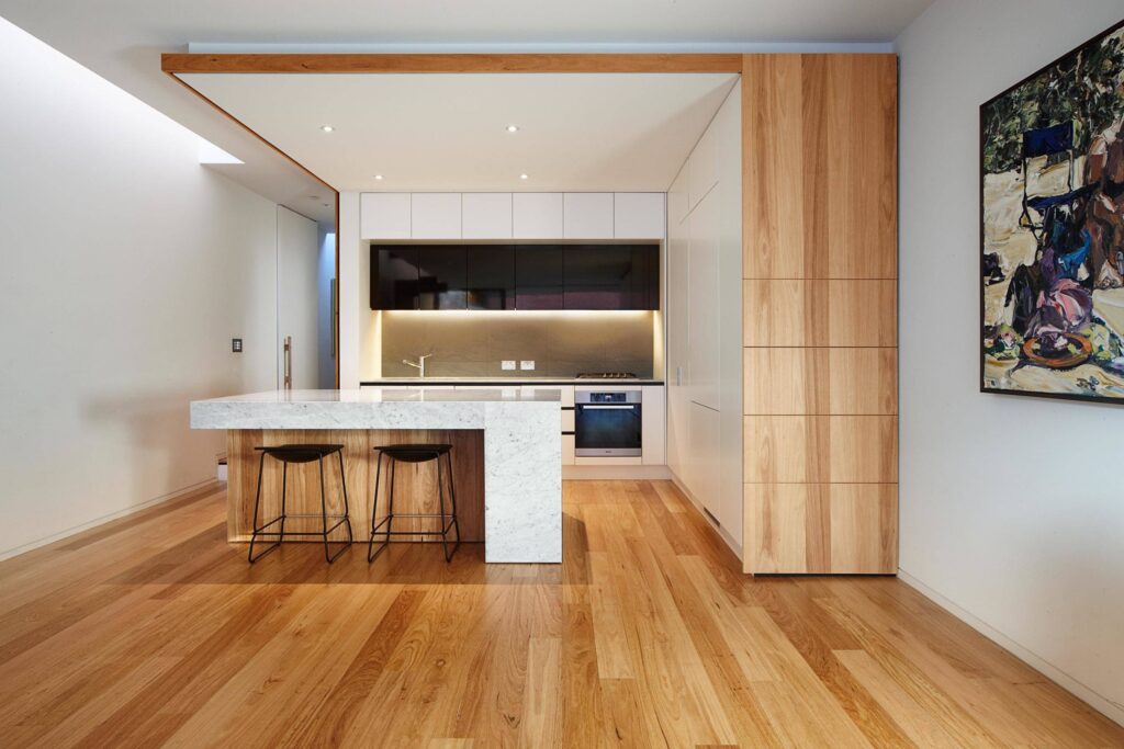
A large and spacious kitchen that is absolutely minimalistic and clutter-free, this design has richness and luxury. The use of elegant materials and task lighting suited for the space, this is a modern kitchen design. The two-toned room with whites and browns with some black accents like the overhead cabinets and island stools create a seamless design blend.
Design 18
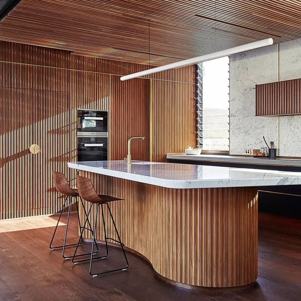
The use of wooden planks, organic base for the regular kitchen island top, daylight flowing in through the cleared louvered window and some task lighting, all come together to create a perfect Japanese style kitchen design. Minimalistic accessories and fittings are used with some modern kitchen appliances.
Design 19

A soothing and pleasing design, this design uses white for the majority portion. Complemented with soft wood tones, the gray backsplash adds color and interest. The pendant light along with the statement mirror wall enlarges the sense of space with some bright colored dining chairs. This is a space that makes a subtle yet remarkable impact on the mind of the viewer.
Design 20
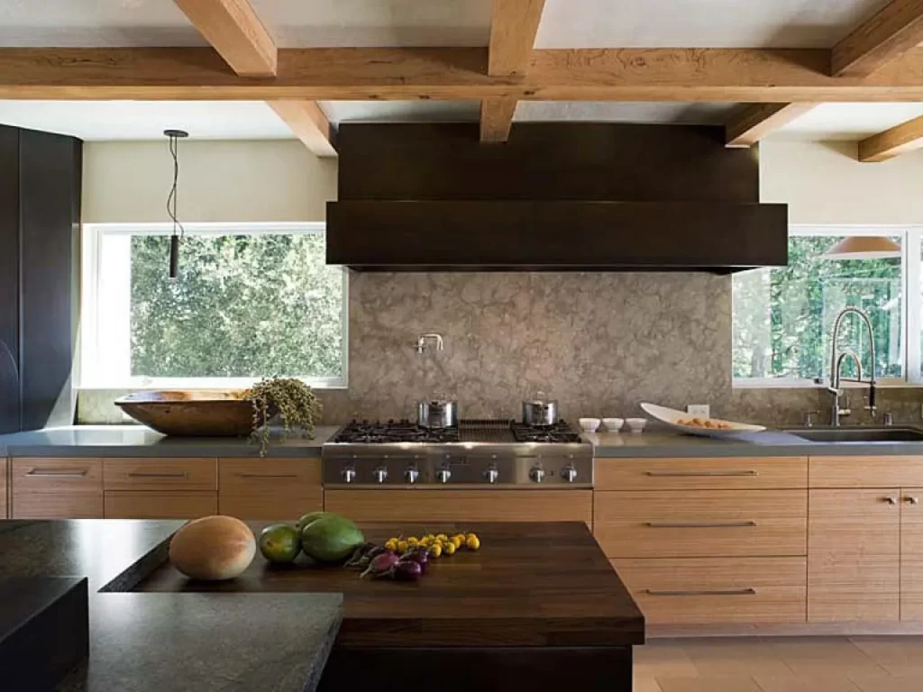
An elegant Japanese kitchen design complete with different tones of brown, the darker shades add elegance while the softer tones balance the space. The interesting choice of color and texture for the backsplash make the space visually appealing. Two large symmetric windows allowing plenty of daylight balance the light within the space.
Design 21

A simple yet clean design, the grooving between the subway tiles adds enough pattern to make this design interesting and visually appealing. The open shelving that matches the tone of the brown used in the design, holds an interesting display. The steel countertop for the working area breaks the monotony and adds functionality to the design.
Japanese Kitchen Design 22
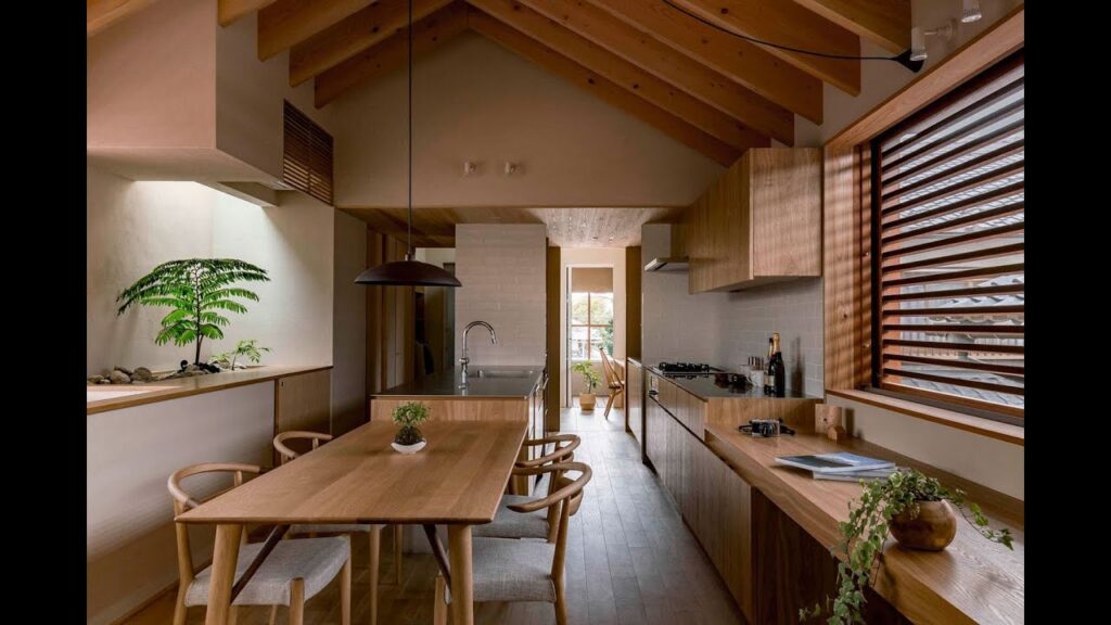
An elongated space, this design is clean and clutter-free. With designated areas for each function, the space is well divided for circulation. Pops of green and some elegant pendant lights complement the exposed beams creating a seamlessly designed space.
Japanese Kitchen Design 23
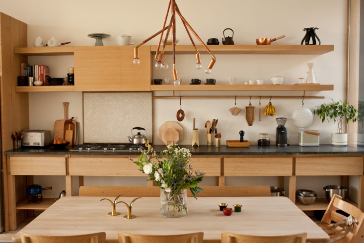
A kitchen design in an all wood tone, the soft shade appeals to the eye without becoming overpowering. The open shelving display is well balanced between the countertop and the above spaces. Statement lighting over the dining table that is adorned with fresh flowers completes the kitchen design frame.
Japanese Kitchen Design 24
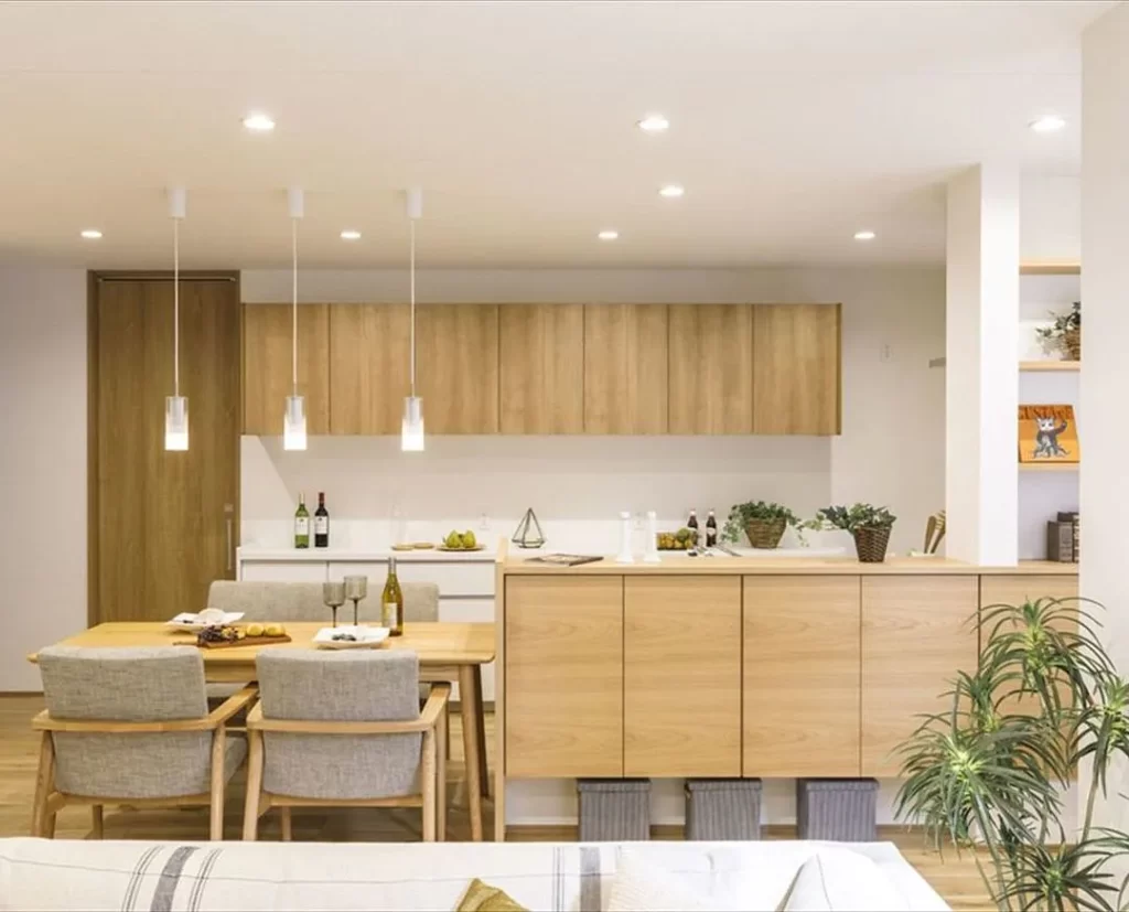
A complete soft toned kitchen design accentuated by the use of white for all walls, the indoor lighting and the pendants over the dining area transform the look of the space. The soft gray tones used for upholstery balance well with the color combination. Pops of green all over make the space visually interesting adding color to the neutral palette.
Japanese Kitchen Design 25
